YouTube thumbnail design: make the idea clear before making it loud
Build a thumbnail around a recognizable subject, one useful contrast, and an honest promise that stays readable at feed size.
The quick answer
A strong thumbnail makes the video's subject and reason to care understandable quickly. Start with one visual idea, establish a clear hierarchy, and check it at small sizes beside the title. Decorative intensity cannot rescue a confusing or unsupported promise.
In this guide
Choose the visual question
Before opening a design tool, write what the image should make a viewer wonder. “Will this tiny desk actually hold a complete recording setup?” is a usable question. “How can I make this look more exciting?” is too vague to direct the composition.
Identify the subject, the contrast, and the evidence. The desk is the subject; limited space is the constraint; a visible usable setup is the proof. You may not need a face, an arrow, and six words if the core relationship is already clear.
Establish a visual hierarchy
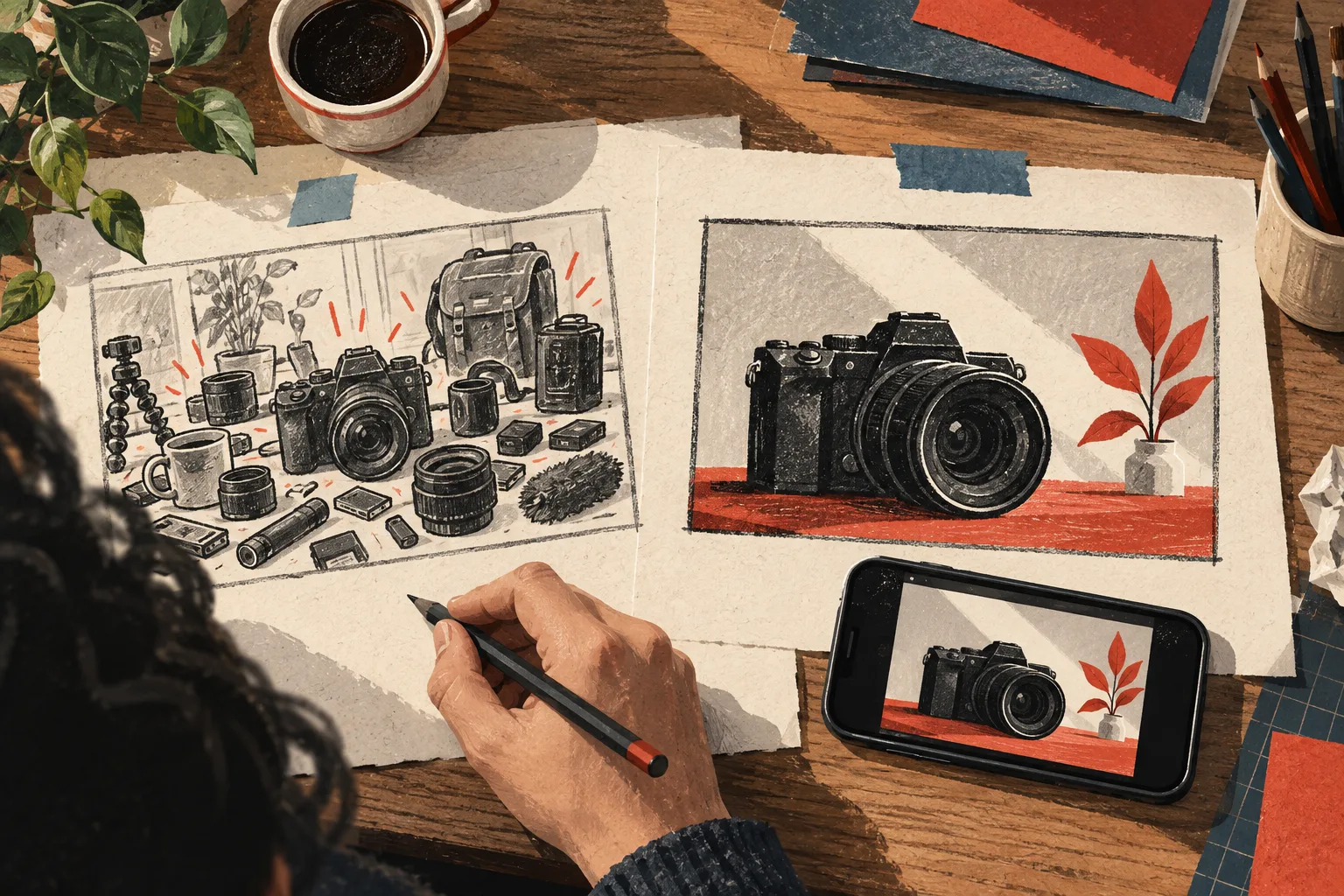
Choose one dominant element. Make supporting elements explain it rather than compete with it. If every object has a bright outline and every word is equally large, the viewer must do the sorting work you should have done.
A useful hierarchy can be tested by briefly looking away and returning. What do you notice first? Does that element communicate the intended subject? Then shrink the image. If the key relationship disappears, the hierarchy is not yet strong enough.
Use contrast to explain something
Contrast can mean light against dark, large against small, cluttered against organized, or before against after. Choose the contrast that supports the actual promise.
For a cable-management video, a tangled underside beside a clean accessible arrangement communicates a transformation. A random explosion graphic may add visual energy without helping the viewer understand the result.
Keep the comparison honest. If the before image is deliberately darkened or the after image hides the remaining mess, the thumbnail can imply a stronger outcome than the video demonstrates.
Design beside the title
The title can carry the constraint while the image carries the result. “A filming setup for a desk that folds away” pairs naturally with an image showing the folded and usable states.
Read the two together. If the image suggests a product review but the title promises a room makeover, decide which promise is primary. The viewer should not have to resolve that disagreement before clicking.
Run a practical design review
- Can someone identify the subject without your explanation?
- Is the most important distinction visible on a phone?
- Does text add information rather than repeat the title?
- Are faces, objects, and labels large enough to interpret?
- Does the image accurately represent the video?
- Is the style recognizable without copying another creator's composition?
Ask a target viewer to describe what they see and expect. Their first interpretation is more informative than a general compliment about the design.
Use references for principles
Research thumbnails that serve a similar audience and inspect the mechanism: framing, contrast, object scale, or the relationship between title and image. Include ordinary-performing examples so you do not assume every common design feature caused success.
Vidfora's thumbnail search helps gather references, Thumbnail editor supports design work, and Thumbnail Preview shows the package in context. Move through those stages with one clear visual question.
The finished thumbnail should make a worthwhile video easier to recognize. It is a compact explanation of the promise, not a separate artwork with an unrelated goal.
Common questions
Do thumbnails always need a face?
No. Use a face when the person, emotion, or relationship helps communicate the promise. Objects, demonstrations, diagrams, and transformations can also carry a clear visual idea.
Should I use the brightest possible colors?
Use contrast that makes the important elements readable and appropriate to the subject. Maximum saturation everywhere can reduce hierarchy and make the image harder to interpret.
Published by Vidfora, the product discussed in these guides. Examples are illustrative unless a source is named. Editorial approach · Suggest a correction