How much text should a YouTube thumbnail use?
Decide whether thumbnail text clarifies the promise, then edit it for meaning, hierarchy, and readability at small sizes.
The quick answer
Use only the thumbnail text that adds necessary information beyond the title and image. There is no universal ideal word count. Every essential word should remain readable at feed size and help viewers understand the subject, contrast, or payoff.
In this guide
Ask what the words contribute
Text can label a comparison, clarify a surprising result, or identify a constraint the image cannot show. It can also repeat the title, obscure the subject, and make a simple idea feel complicated.
Remove all text from a draft and look at the image beside the title. What meaning is lost? If nothing important disappears, you may not need to add the words back.
Choose the role before the font
A label such as “before” helps orient a transformation. A short phrase such as “no drilling” communicates a practical constraint. A sentence explaining the entire video may be asking the thumbnail to do work better handled by the title.
For a desk-storage video, “no drilling” could matter to renters. “The most incredible organization method you have ever seen” consumes space while adding an unsupported claim. Specificity is usually easier to design than hype.
Edit for meaning, not merely length
Shortening text can accidentally change the promise. “No tools” is not equivalent to “no power tools.” “Free” is not equivalent to “using items I already owned.” Keep the condition that makes the claim accurate.
Write the full intended meaning first, then compress it carefully. If the necessary qualification makes the phrase too long, move the claim to the title or choose a different visual concept.
Set a clear reading order
Decide which word or phrase matters most. Use size, placement, and contrast to establish that hierarchy. Avoid several competing labels with identical emphasis.
Check that text does not cover the evidence. If the important improvement is a small mechanical detail, placing a large caption over it defeats the purpose of the image. The words should guide attention to the proof, not replace it.
Test at the actual small size
Use a realistic preview and read the text without zooming. Check similar letter shapes, thin strokes, busy backgrounds, and line breaks. A phrase that is technically visible may still take too long to decipher.
Try both light and dark surrounding interfaces when available. The border of the thumbnail and the local contrast behind the words matter more than how the design looks against your editor's neutral canvas.
Compare text and no-text versions
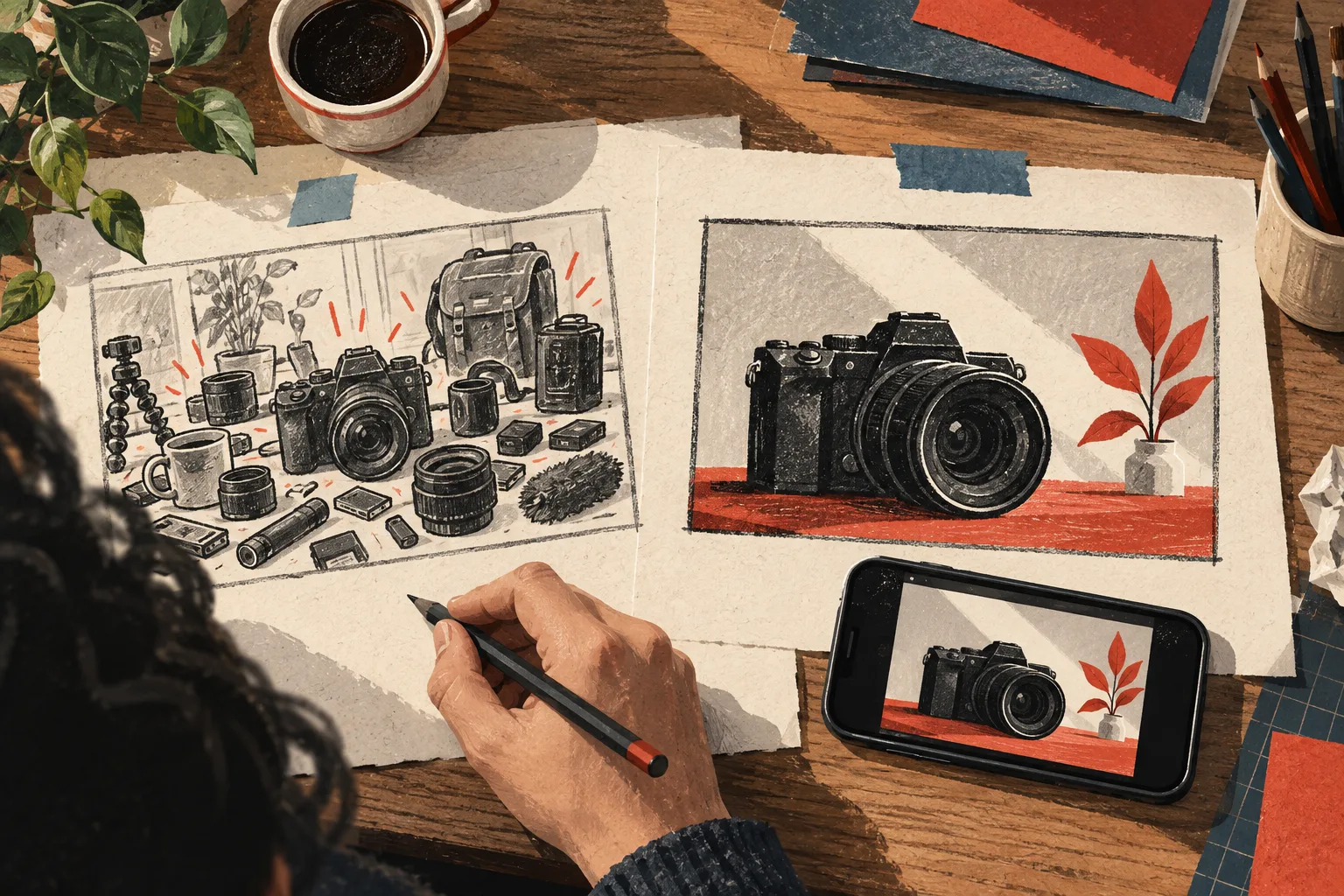
A useful design comparison might include one version with a constraint label and another that communicates the constraint entirely through the image and title. This is a meaningful question about clarity, not simply a preference for minimalism.
Ask a target viewer to explain the promise of each pair. If the text creates a stronger but inaccurate expectation, it is not an improvement.
Keep your brand system flexible
A consistent type style can help a channel feel coherent, but it should not force every video into the same overloaded template. Some subjects need a clear label; others benefit from an uninterrupted image.
Use Thumbnail editor to build variants and Thumbnail Preview to inspect them in context. Save the reason for your choice in the project brief. Over time, you will develop a more useful understanding of when text helps your audience than a rigid rule about always using three words.
Common questions
Is three words the best thumbnail text length?
There is no universal best count. Three unclear words can be worse than a longer necessary label, and some thumbnails need no text. Judge meaning and readability in the actual composition.
Should thumbnail text be different from the title?
It should add value to the pair. Some repetition can reinforce a key idea, but using both surfaces to say exactly the same thing often wastes an opportunity to clarify the promise.
Published by Vidfora, the product discussed in these guides. Examples are illustrative unless a source is named. Editorial approach · Suggest a correction