The mobile thumbnail test: check clarity before you publish
Review thumbnails at realistic small sizes, with title truncation and competing videos, to catch problems a full-size canvas hides.
The quick answer
Test a thumbnail at realistic feed sizes beside its title. Check whether the subject, main contrast, and essential text remain understandable without zooming. This is a clarity review, not a measurement of actual click-through rate.
In this guide
Stop reviewing only the full-size canvas
A thumbnail can look excellent in an editor and become unreadable when reduced. Small labels, subtle facial expressions, thin outlines, and background details may disappear. The problem is not the export quality; it is the information hierarchy.
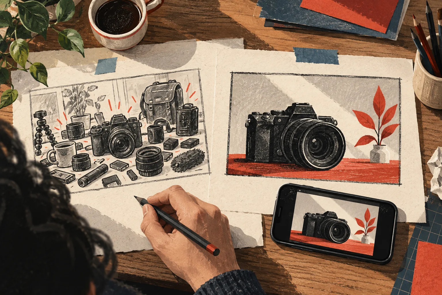
Begin by shrinking the design to the size at which someone might encounter it. Do not lean closer or zoom in. Ask what remains understandable at an ordinary glance.
Check three kinds of information
Subject: can you tell what the video concerns? A small gadget photographed from an unfamiliar angle may need a clearer silhouette or more context.
Relationship: can you see the comparison, transformation, or problem? A before-and-after layout fails if the difference is too subtle to notice at small size.
Text: can you read the words that are essential to understanding? If the title already explains the idea, some thumbnail text may be unnecessary.
Evaluate each separately before adding more emphasis. Making every element bigger is impossible; choose what matters most.
Include the title in the test
A clear image can become confusing beside a truncated title. If the audience or constraint appears only at the end, the visible portion may describe a different promise.
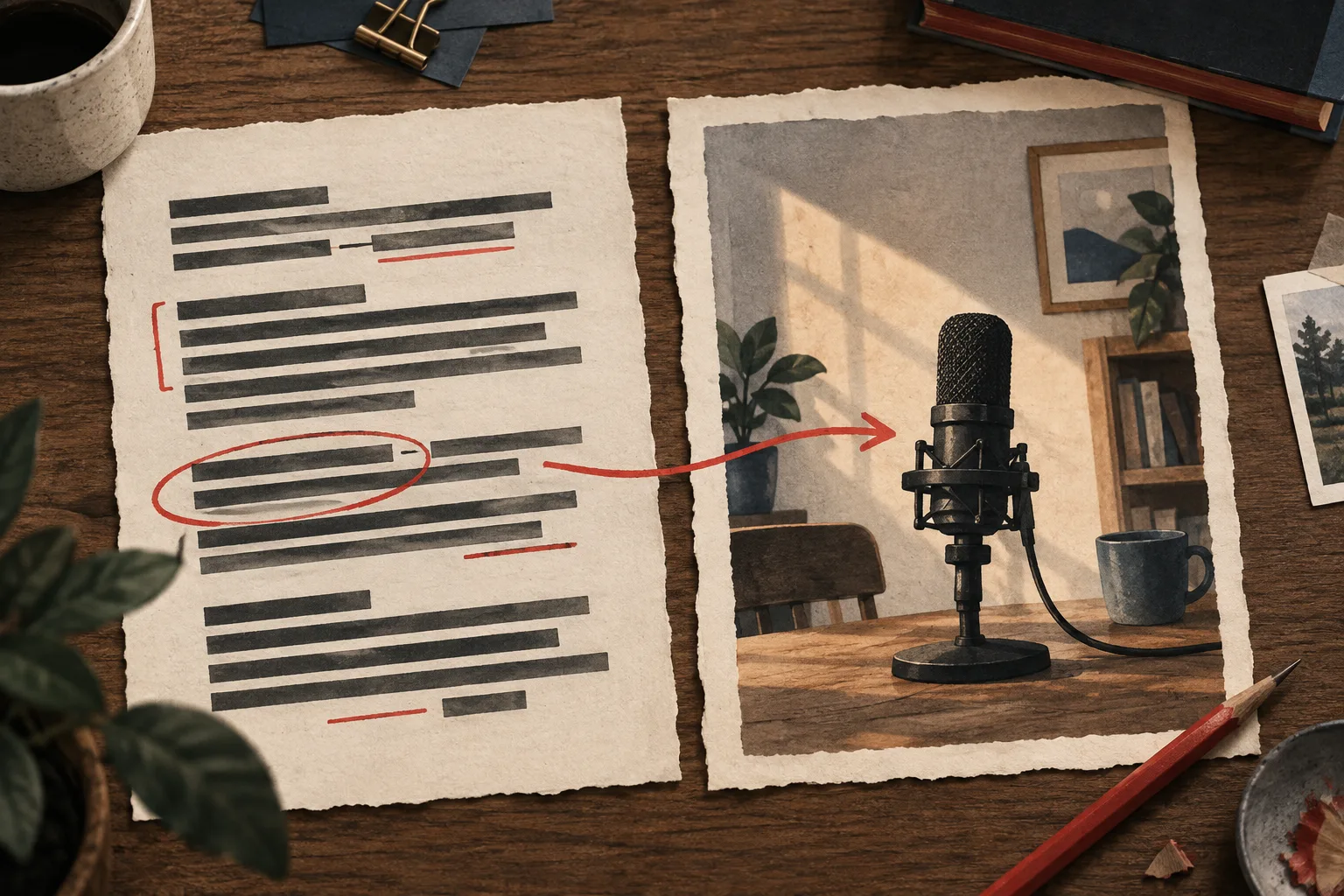
For example, “I built the perfect recording desk…” does not communicate the crucial constraint “for a room shared with two people” if that part disappears. Consider moving the meaningful distinction earlier or letting the image communicate it more clearly.
Use a repeatable review sheet
| Check | What to observe | Possible revision |
|---|---|---|
| First glance | The element noticed first | Increase the relevant subject's prominence |
| Small text | Words that vanish or merge | Remove, shorten, or enlarge them |
| Comparison | Whether the two states differ visibly | Simplify framing and make the real distinction clearer |
| Crop | Important details near edges | Reposition the subject |
| Surroundings | Whether the image remains interpretable among other videos | Strengthen hierarchy rather than adding random decoration |
Record the issue before editing. This prevents a design review from becoming an endless sequence of subjective tweaks.
Ask for interpretation, not preference
Show the pair briefly to someone who resembles the intended viewer. Ask, “What do you think this video will show?” Then ask what caught their attention. Avoid explaining the concept first.
If they describe a different promise, investigate the cause. Maybe a label implies a product comparison, or the image emphasizes a secondary object. Their misunderstanding is useful even if they say the thumbnail looks attractive.
This informal check does not estimate audience CTR. It catches ambiguity and readability problems before publication.
Preview the actual contexts
Vidfora's Thumbnail Preview places your package in YouTube-style home, search, sidebar, and mobile layouts. Inspect more than one context and use the available theme options to check contrast.
After revising, repeat the same checks once. Stop when the important information is clear and the promise is accurate. The next stage of learning comes from actual viewers; no amount of enlarging and shrinking the image in an editor can replace that evidence.
Common questions
Can a mobile preview predict CTR?
No. It can reveal readability, hierarchy, and title-pairing problems. CTR requires real impressions and audience behavior, which a design preview does not measure.
How much text should fit on a thumbnail?
Use only the text needed to clarify the promise. The right amount depends on the composition and title, but every essential word should remain readable at the intended small size.
Published by Vidfora, the product discussed in these guides. Examples are illustrative unless a source is named. Editorial approach · Suggest a correction